


+353 (0)1 293 7787
hello@bradleybrand.ie
109 Q House,
Furze Road,
Sandyford, Dublin 18
Ireland, D18 E6H9


In an overcrowded dairy section, it’s easy to become lost. Losing customers to competition is inevitable, what matters is how a brand reacts. Changing customer preferences mean that Yoplait yoghurt needed to ensure its packaging remains appealing and relevant to the target audience.
Yoplait Ireland engaged with us to redesign their three main ranges to accurately represent their brand’s mission and value - bringing colour and fun to their brand experience.

After our stringent visual audit on their packaging, our findings drove the design direction, knowing what customers wanted and needed.
 Identify equity to retainDefine the rangesCreate differentiationCraft the languageDesign the packaging
A strong brand identity is essential in conveying a brand’s personality, story, and values to consumers, ultimately building trust and fostering brand loyalty. This drove our design process to ensure that the new packaging would resonate with consumers.
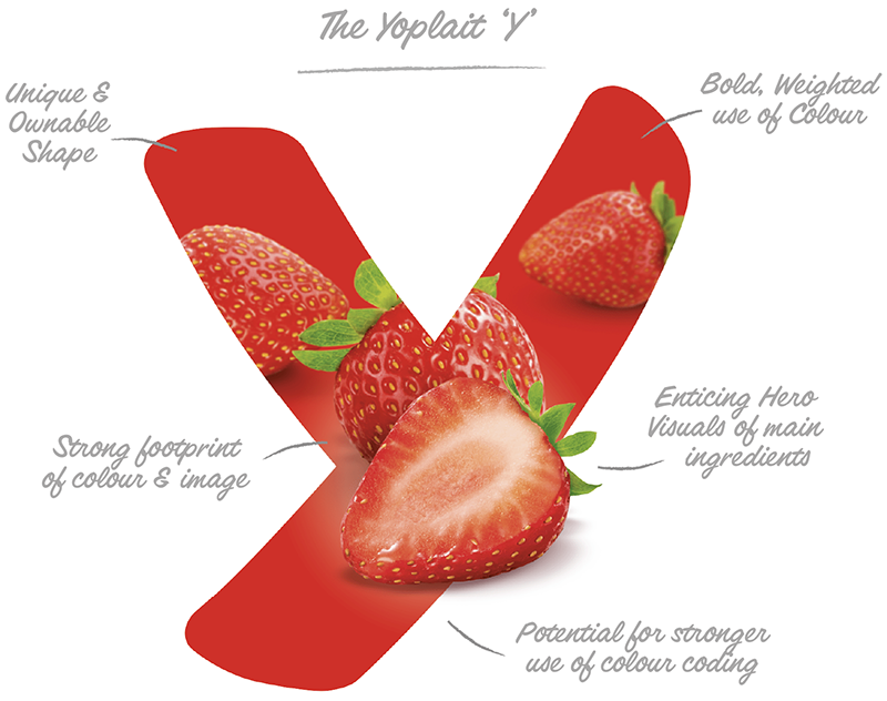

Part of our brief was to inject new life and vigor into a static brand. We developed the “Wave” device that anchors the top of pack, whilst also creating a colourful repeat pattern that builds strong shelf impact when seen across the three sku’s on shelf. This visual representation of the brand triggers thoughts and feelings about the product which in turn can directly impact the purchasing decision.
To support the well known brand identity - we developed “own-able” crafted font Product Descriptors that help set the packaging apart from other brands but also portrays what the brand is about - fun and life!

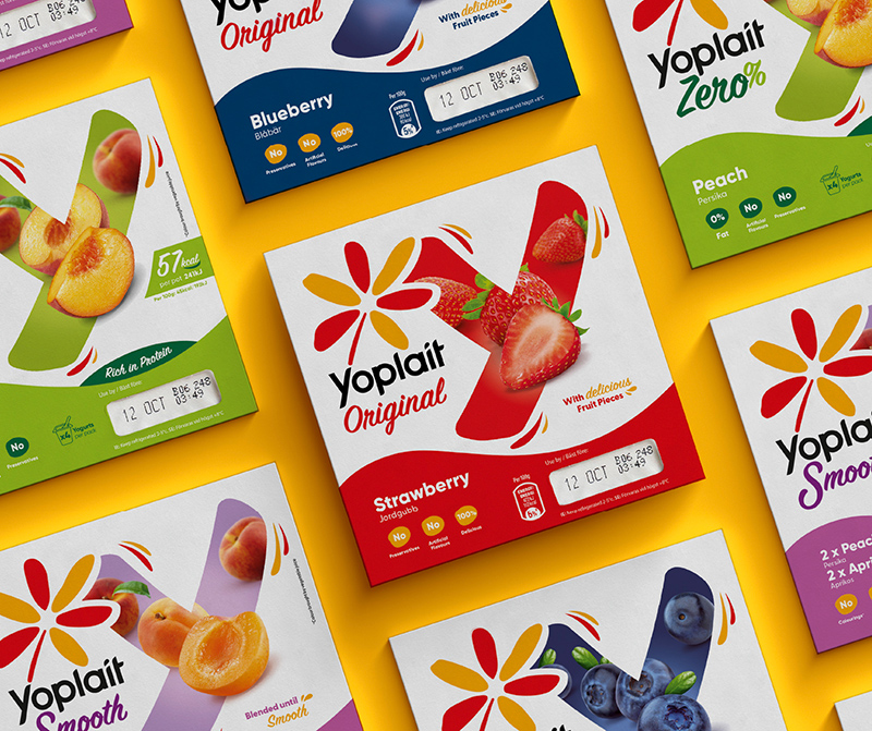
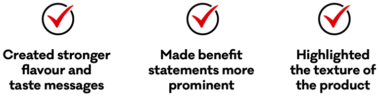
Our strategic approach delivered lots of key benefit messages for the brand - we harnessed these and ensured they had proper real estate on each pack.
 Hierarchy: Logo is the HeroDifferentiation: 3 x Defined RangesLanguage: Taste & Flavour CuesFootprint: Colour blocking on shelf
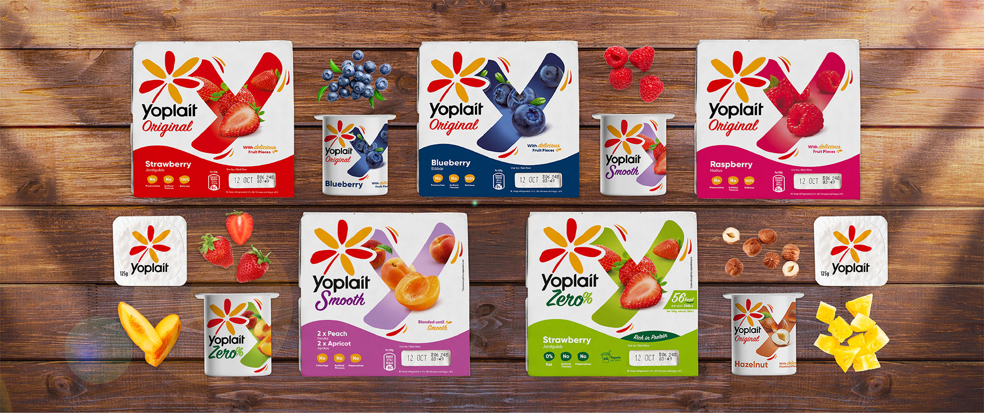

Get in touch today! We’d be happy to help...

Sign up for industry views, Bradley news, and all things brand.
T +353 (0)1 293 7787
E hello@bradleybrand.ie
109 Q House,
Furze Road,
Sandyford, Dublin 18
Ireland, D18 E6H9


