


+353 (0)1 293 7787
hello@bradleybrand.ie
109 Q House,
Furze Road,
Sandyford, Dublin 18
Ireland, D18 E6H9


Cleanmarine, a nutritional supplement company, approached Bradley with a hero product that was giving people very clear and undeniable results - however only those who knew to try it were benefiting.
They needed to reposition themselves in a way that clearly communicated the benefits and full effects their product could achieve.
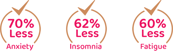
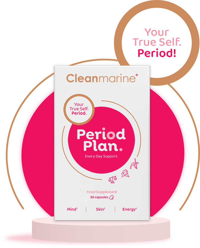
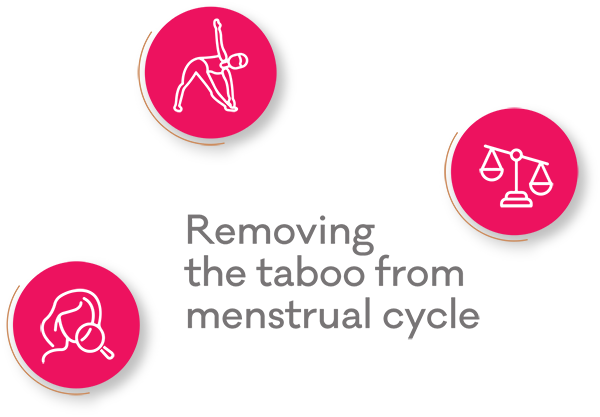
What For Women was missing was the emotional connection on how this product added to people’s lives, and clear design direction to communicate this. We removed the taboo from the menstrual cycle. We used the scientifically backed benefits of the product to communicate its positive effect on people's everyday lives. We did this by appealing to the consumer's emotional well-being. Encouraging consumers to live well and put their sense of self first, Cleanmarine now invites people with periods to take “your daily do good”, to “keep your spark” and to “mind your mind” - all in order to “Be your true self all month long. Period.”
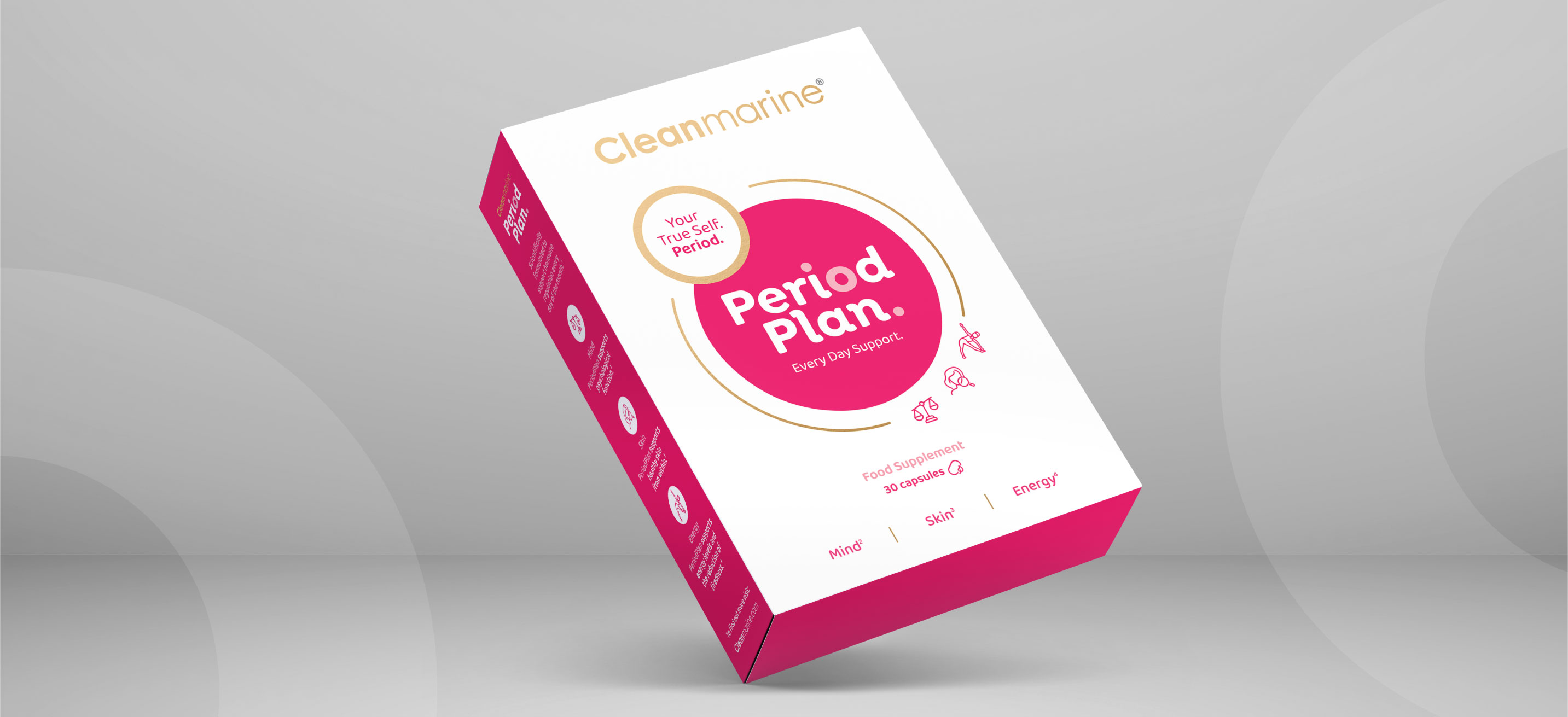
Making the consumer feel seen, we brought them into the equation as part of the purpose behind the creation of this product; Showing consumers that this product is “designed with you in mind” gives them the confidence to trust that this brand knows what is best for them. Calling it out and casting no more shadows on menstrual health, Bradley brought the name PeriodPlan to market, and it first launched with roaring success in the UK, now can be found across Ireland.
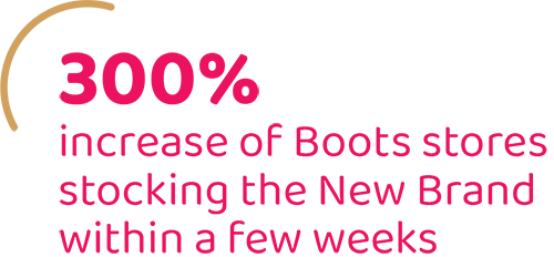
Upon seeing and understanding the brand
PeriodPlan went from being stocked in
130 Boots Stores to 360+ and counting.
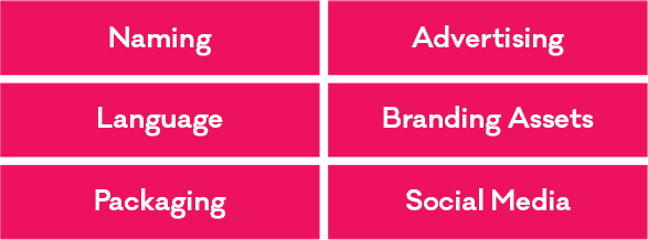
Our process
Using all the findings from strategy and research, we set about developing naming territories for the new brand name. All language, key message development, packaging and marketing support was created in line with the business objective.
When considering a new brand name, we always start with the end user in mind.
When setting out to create PeriodPlan, we wanted “big thinking” from the outset. We built on a brand health truth which was that this product will provide daily nutritional support everyday of the month, giving you better support during your period. The new name needed to be direct, no-nonsense and disruptive.
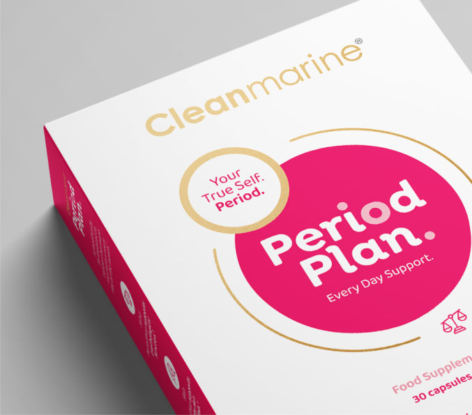
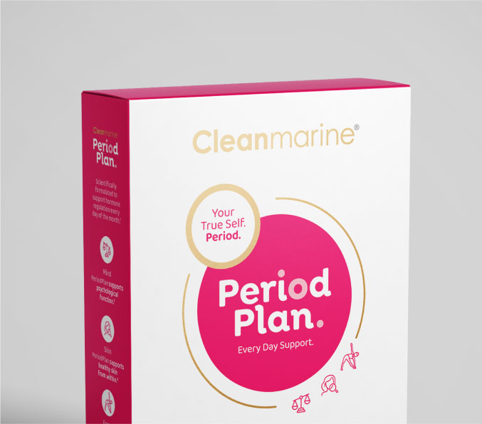
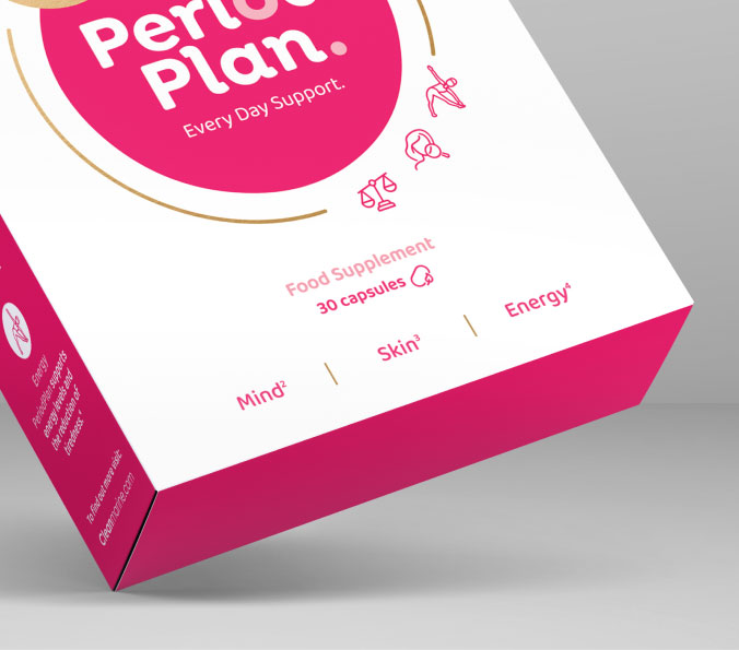
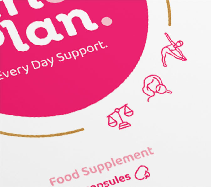
Small packs need to work extra hard in crowded spaces. We designed this pack focusing on clarity and simplicity.
We wanted to dispatch instantly what this product was for and who the brand behind it is. By creating a central circular device, we created a bulls-eye for shelf impact - consumers see patterns first. Our circular packaging device gets attention on shelf and has great retina retention (ie. your eye remembers it)
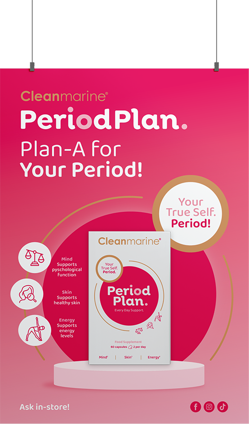
A good ad campaign should evoke the right emotions that represent what you are advertising.
Our campaign line, "Plan-A For Your Period" speaks directly to the audience, telling them that PeriodPlan have the right plan for you.

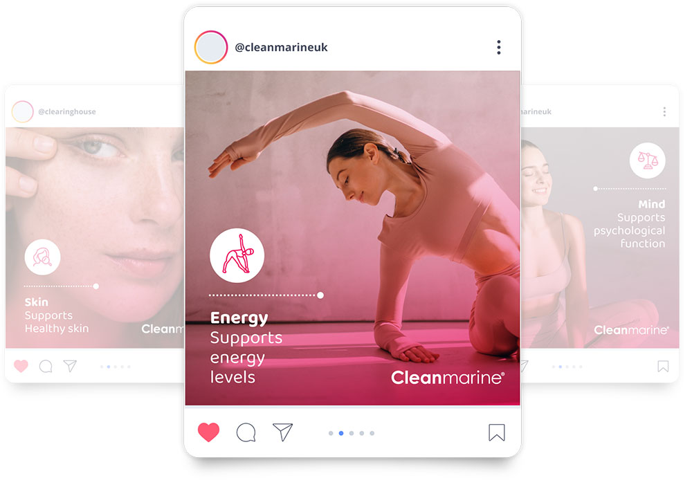
As part of the project we designed a series of digital templates that would be simple enough for the brand to use internally. We created a suite of designs that allowed imagery to take over the prime real estate space, each image was supported by a benefit icon and an allocated area for a key message. By keeping the design simple using a dedicated area for each item, we gave the internal brand team easy and useful assets.
Launching a new brand requires support. We scoped and set out clearly what point of sale would best support the end user, the pharmacy.
We delivered designs for posters, wobblers and lots of other in-store assets. We also used a new printing technology called Scodix to create stand out point of sale assets that used a gold foil.
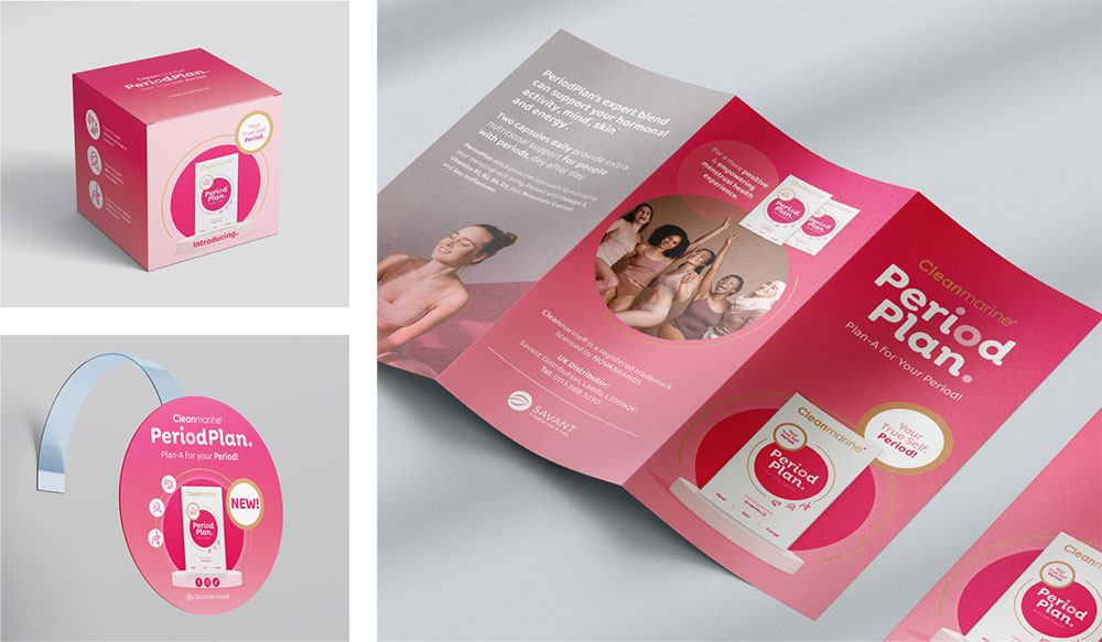
We approached the design of this typographic, approachable and fluid word-mark. We used the circular shapes of the "o" and "i" to add interest and curiosity to the rounded letterforms. The weight of the font is strong but not shouting.


Get in touch today! We’d be happy to help...

Sign up for industry views, Bradley news, and all things brand.
T +353 (0)1 293 7787
E hello@bradleybrand.ie
109 Q House,
Furze Road,
Sandyford, Dublin 18
Ireland, D18 E6H9


