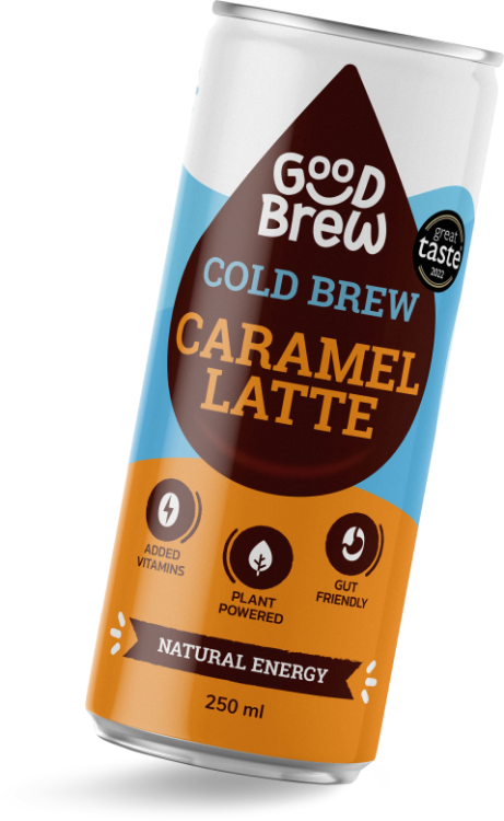
Start up brands are always moving and iterating, and we’ve been across GoodBrew’s journey from inception and creation to refresh and renew for GoodBrew 2.0. GoodBrew further developed their product by bringing added health benefits to their convenience drink.
With a change in product, and a change in packaging, Bradley’s challenge was to help GoodBrew to remain relevant and appealing to their target audience, whilst adapting to the new cans, and incorporating new key benefit messaging.

Knowing their previous packaging well, we applied a rigorous visual audit on competitor packaging in the US and others in a similar space here in the Irish marketplace. Our findings drove the design direction with an understanding of what customers want and need.
 Identify equity to retain
 Define the flavours
 Create differentiation
 Craft the messaging
 Design the packaging
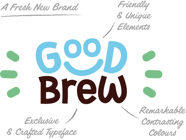
A strong brand identity is essential in conveying a brand’s personality, story, and values to consumers. The GoodBrew blue has become the hallmark of the brand, and remains in the brand identity today. This ultimately builds trust and fosters brand loyalty, continuing to resonate with consumers.

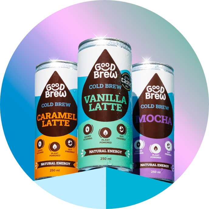
Part of our brief was to bring shelf stand out for every flavour, not just the brand. We crafted colours to work in tandem with the brand, whilst clearly differentiating them by product flavour. A brand’s visual identity provokes thoughts and feelings about the product, directly impacting the consumer’s decision.
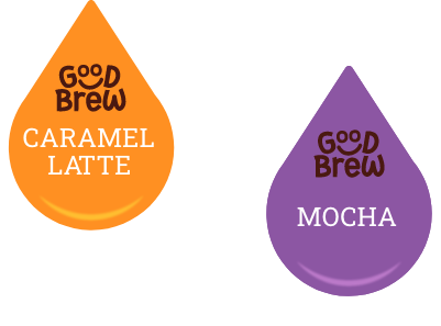
Sitting in the fridge next to other health food, wellness drinks and natural energy drinks alike, GoodBrew now stakes its place on shelf. Setting it apart from the others, the new brand identity and packaging design brings the good mood essence of the brand to life.

With a new and improved recipe, the newly added ingredients and health benefits deserved adequate call out on pack. Spotlighting these key taste, flavour and health benefits, now the consumer decision is better informed.
 Hierarchy: Logo is the Hero
 Packaging: New pack, now shelf stable
 Differentiation: 3 x Defined Flavours
 Language: Flavour & Health Cues
 Footprint: Colour presence on shelf